Case Study
Martin
A type-led editorial and poster that amplifies protest voices through contemporary design.
The Challenge
Develop an editorial piece centred on a single typeface, using design to communicate both
its visual qualities and historical significance.
This project explores Martin, a typeface by
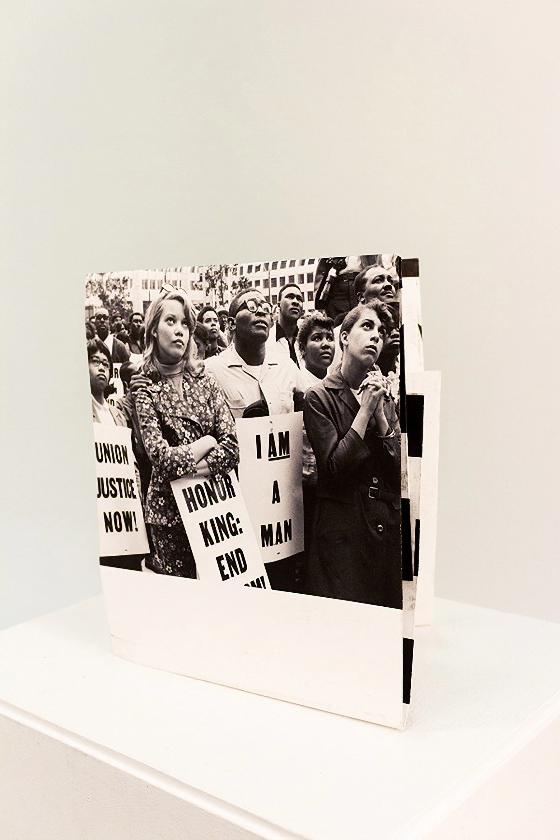
Tré Seals (Vocal Type), inspired by the handwritten protest signs of the 1968 Memphis Sanitation Strike. The aim was to translate this history into a contemporary editorial outcome that foregrounds the typeface’s cultural and political context while encouraging deeper engagement with its origins.
The Solution
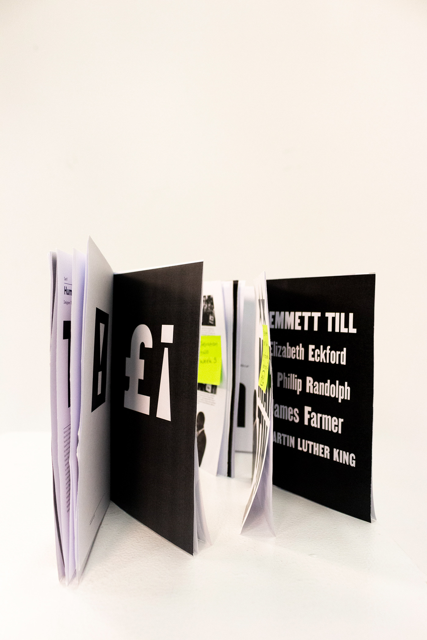
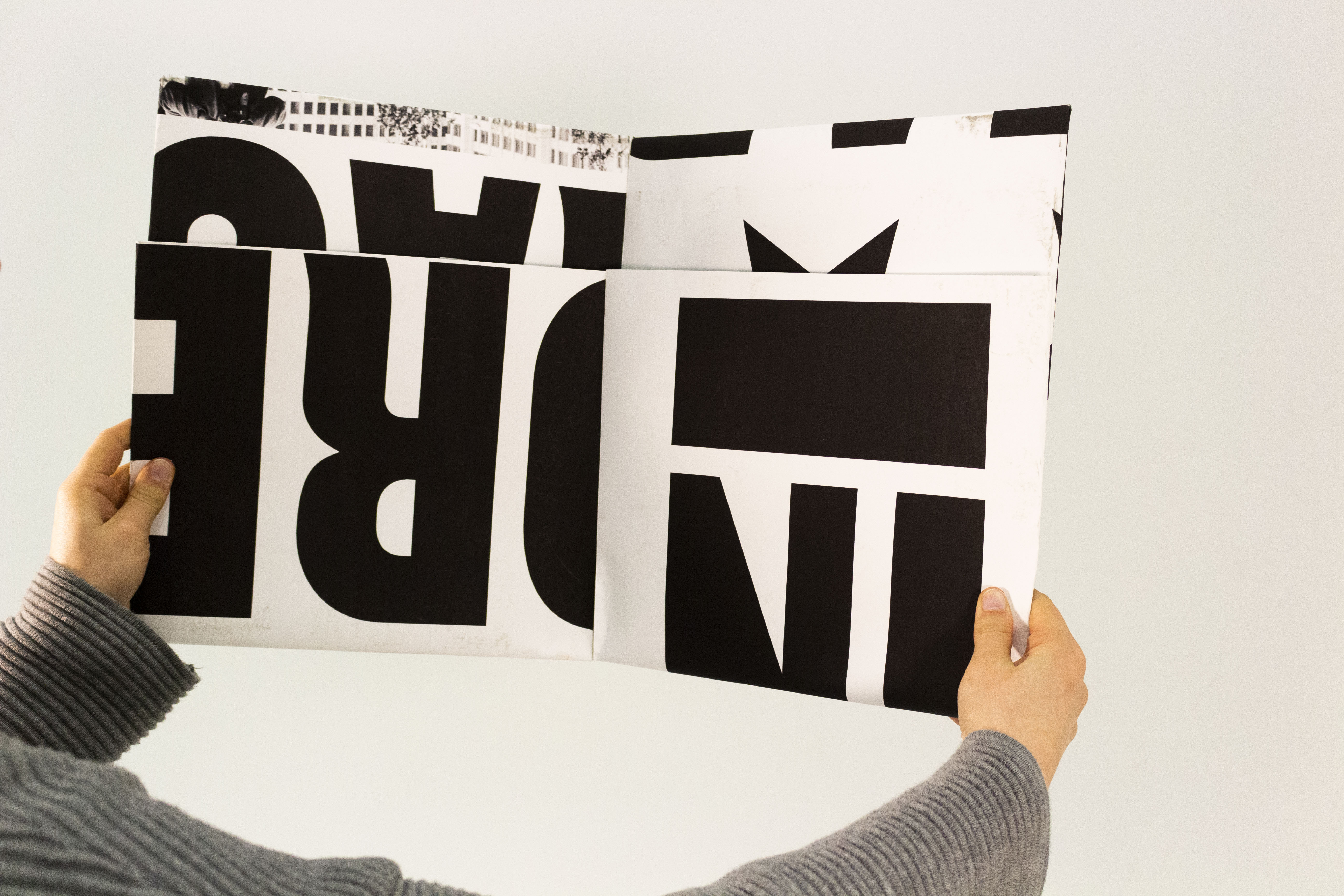
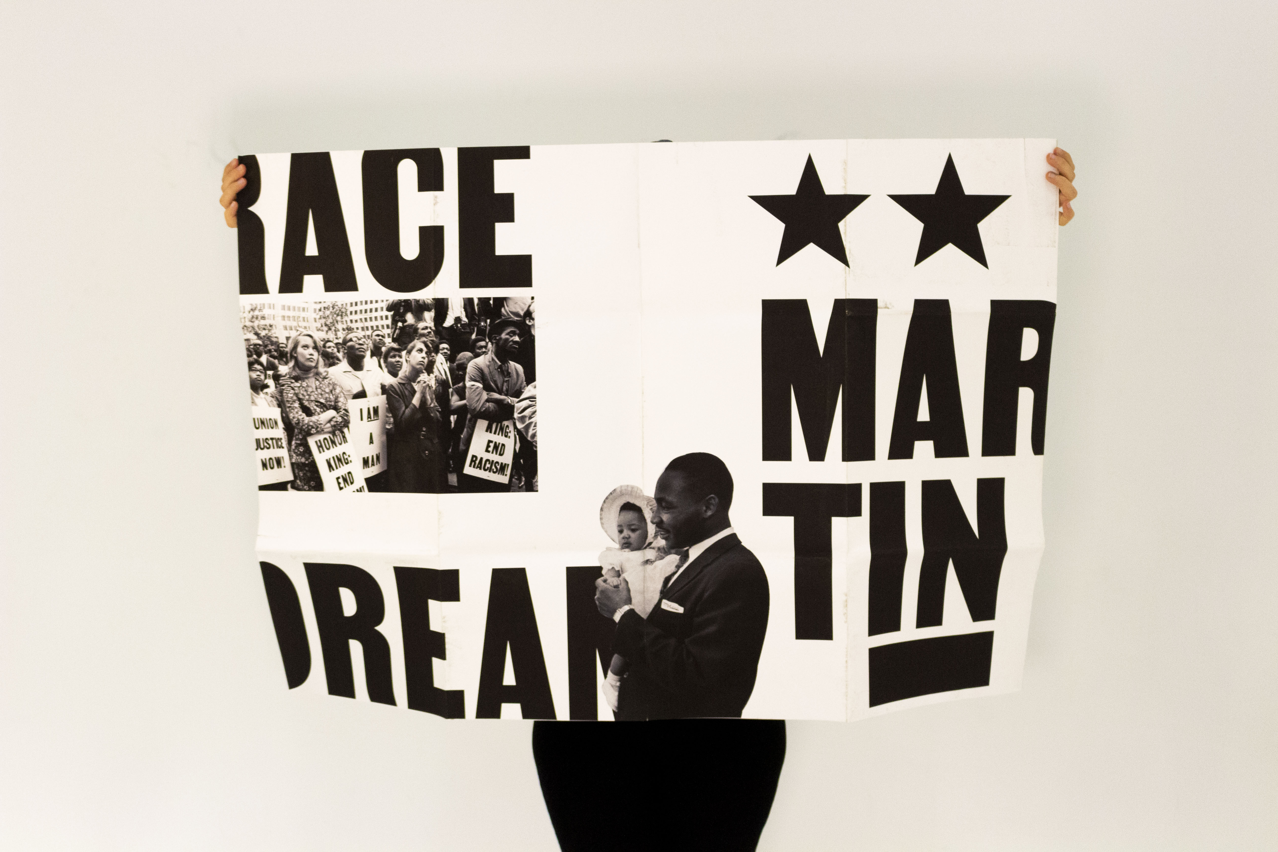
A newspaper editorial publication with a dust jacket that unfolds into a poster, extending the piece beyond a traditional reading experience.
The design translates protest language into a contemporary typographic system, using material experimentation to position type as both message and medium. The final outcome is a tactile publication that reinforces themes of social justice and resistance.
The creative process
The creative process combined typographic exploration with hands-on print experimentation, testing layouts, imagery, paper formats, and production methods to develop a tactile editorial outcome. Through prototyping and collaboration
with printers, the final piece evolved into a newspaper publication with a dust jacket that unfolds into a poster.


Typography
Martin was chosen for its strong historical and political context, with its forms rooted in the handwritten protest signs of the 1968 Memphis Sanitation Strike, allowing typography to become both a visual and narrative device within the editorial.

Colour palette
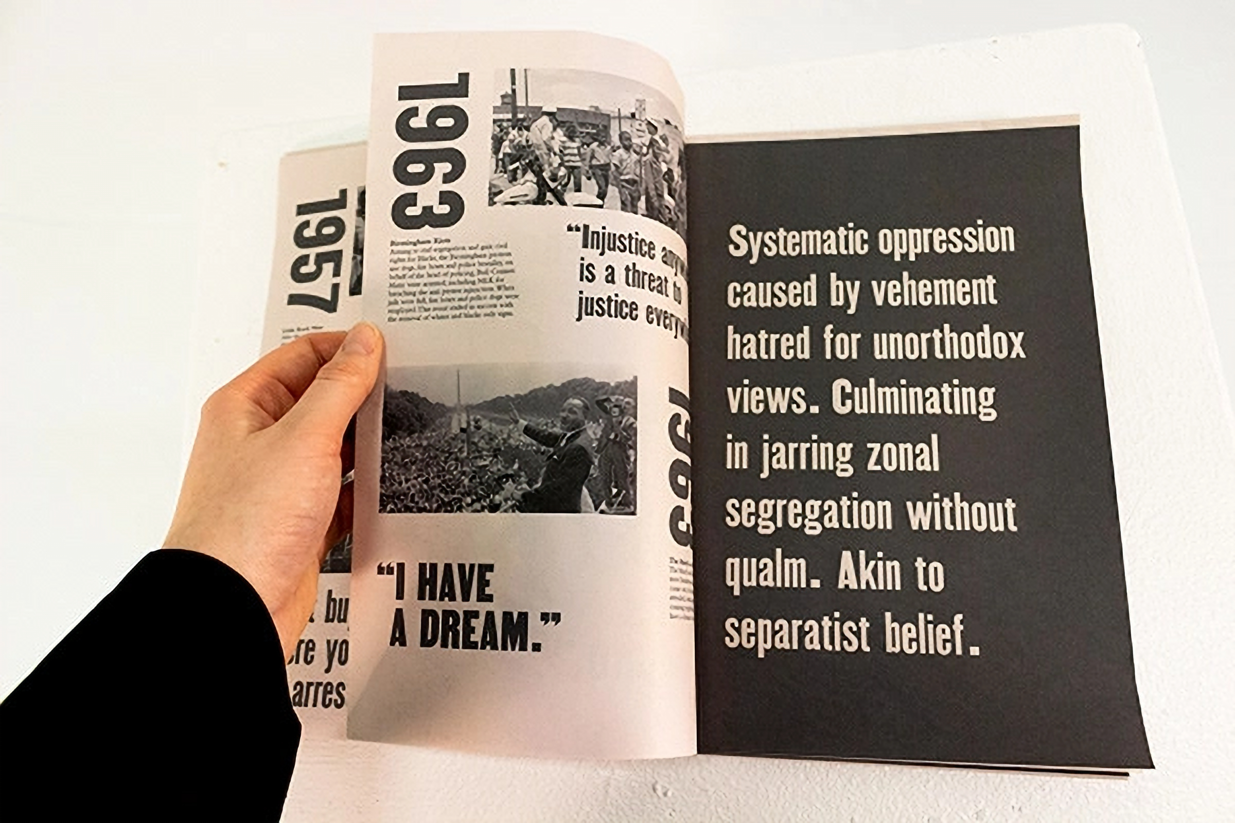
The editorial uses a strictly black and white palette to reflect the historical tension and social division surrounding the Civil Rights Movement, while reinforcing the raw, protest driven origins of the Martin typeface.

Copy
The copy explores the history of the Civil Rights Movement, highlighting key figures, moments, and protest language connected to the origins of the Martin typeface. Structured as a historical timeline, the editorial combines contextual storytelling with type specimen pages that showcase the glyphs, forms, and expressive qualities of the typeface.

Project Gallery
Visual highlights


Skills Highlight
Print & Material Exploration
Developed a tactile outcome through format and folding, extending the editorial into a physical, interactive artefact.
Editorial design
Designed a cohesive publication through grid, pacing, and layout to guide narrative flow across spreads.
Typographic application
Deployed the Martin typeface with intentional hierarchy and composition, emphasising its expressive and historical qualities.