Case Study
Smalls
A conceptual brand identity for smalls, a neighbourhood wine bar centred around natural wine, small plates, and slow, social dining.
The Challenge
Create an identity for a natural wine bar that captures the ease and intimacy of natural wine culture while remaining visually distinct within a saturated hospitality space.
The Solution
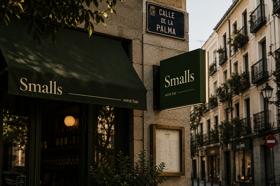
A stripped-back, typographic identity built
on simplicity, spacing, and tone of voice.
The brand has been designed to live across
menus, signage, and social touchpoints,
The creative process
I began the project by establishing a creative brief
and moodboarding with found imagery, followed by
a process of exploration and experimentation across typography, layouts, and visual applications. Through refinement and iteration, I developed a cohesive brand identity that balances sophistication with accessibility.

Typography
The typography was selected to reflect the balance between sophistication and ease that defines Smalls. Cormorant Garamond adds an editorial and timeless quality to the brand, while DM Sans keeps the brand feeling modern, accessible, and understated. The combination feels refined without becoming overly formal or exclusive.

Colour palette
The colour palette was directly extracted from imagery that embodied the atmosphere of Smalls. Drawing from Mediterranean foods, natural wines, olives, glass reflections, and warm evening lighting, the palette balances sophistication with warmth. Deep greens create depth and richness, while softer neutral tones introduce approachability, reinforcing the brand’s relaxed yet refined identity.

Copy
The copy has been intentionally kept simple and inviting. It reinforces the idea that Smalls is a place of openness and ease. It is a wine bar that feels sophisticated without feeling exclusive. While the imagery and design communicate refinement, the tone of voice introduces an element of approachability, making the brand feel warm, and social.


Minimal editorial graphics, feels
social and authentic. Photography is combined with
curated food and wine pairings. Social media designs feel inviting and conversational.
Social media strategy
Smalls gets social
How smalls communicates
In writing
Audience
Local young adults that appreciate
good natural wine and relaxed sophistication without exclusivity.
Tagline & copy
Poured easy. Natural wine. Small plates.
Additional copy - For small plates and big nights.
Tone of voice
Natural and social. The right amount of playful. Speaks to a young audience by suggesting quality without snobbery.
The logo is a simple wine glass outline with the smalls text following the outline of the wine glass centre.

More collateral

Bar menu

Instagram page
Skills Highlight
Visual Tone
& Positioning
Shaped a brand language that feels approachable, social, and design conscious without leaning into traditional wine industry tropes.
Menu & Print Design
Created editorial-style layouts that enhance readability while contributing to the overall
brand experience.
Brand Identity Design
Developed a cohesive visual identity that balances minimalism
with warmth, creating a distinctive and recognisable hospitality brand.
